In the past few weeks, I’ve been working to add more depth to the game, and finished up some of the major systems. The biggest set of changes has been with the rooms, switching up how they worked internally, and solving a few problems along the way.
At the moment, the first thing needed is a construction office. It’ll hire construction workers to build the rest of your rooms. Only one construction worker can be dispatched to a newly built room at a time from each individual construction office, but building more offices can speed up the process of building a new room. Once rooms are built, they’ll have various requirements before people will rent them, or show up to shop at stores or eat at restaurants. Hotel rooms can be rented out, but will get dirty once everyone has left for the day, so they’ll need to be cleaned regularly. Security personal will occasionally need to be dispatched to rooms in case of threats. Rooms have a variety of factors that go into keeping high rating, from surrounding noise and beauty levels to how happy their tenants are, to how much money they’re making per day.

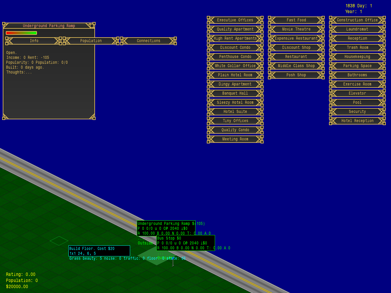
There are still plenty of systems and other things to add and improve upon within the game. However, most of the major functions of the rooms are in place, so today, I’ve begun working out the interface layout that shows up when you query a room (seen above). This is not final (it needs a fair bit of work, obviously), but it contains all of the information about the room that the player will need. the red to green rectangle is the rating indicator, which will provide more detailed information when the player hovers over it. The three buttons will turn into tabs (defaulting to showing the info panel), and the info panel contains details from the income of the day and current rent price to how old the room is and “thoughts” which are more like messages from the room itself (and where you can find out if you’re missing a requirement or similar things).
Disclaimer: I’m fully considering the fact, that I have zero idea how the interface works and that it’s a heavy WiP, but nonetheless there’s a few things which spring to mind immediately:
1. How vital to gameplay is the info when hovering over the red/green rectangle? Because there’s nothing more frustrating than constantly needing to hover-to-make-visible. So if it’s only two or three values, I’d recommend to make them visible permanently on the top level. General rule of thumbs: If it’s vital to decision-making, the make it accessible instantly.
2. Don’t put that heavy ornamentation on every single button. Or at least reduce it significantly. Currently it the buttons an illegible mess, where the users relaxed gaze is drawn towards the “noisy” button edges, instead of the actual button label. In fact, it’s straining to the eyes to focus on the label. Make it simple and obvious to read the labels and keep the ornaments to outer frames like with the room query panel.
3. Yellow text on brown background is not the most legible of combinations. So either strengthen the contrast or make the font weight higher.
Having high hopes for the project! Keep it up!
Thanks for the feedback!
1. The info when hovering over the red/green rectangle shouldn’t be vital to the gameplay (and the idea is to have it available elsewhere as well). It’s basically going to be a more detailed breakdown of how the rating is calculated. I’ll be adding the actual rating as a number to the window as well (and/or maybe getting rid of the shaded rectangle entirely, depending on how things go)
2. The buttons for this window are going to become a lot simpler. The ornamented buttons are going to be used sparingly, and might get another round of changes to make them a bit less decorated.
3. The background is a gradient of grays, but with all the yellow borders and text it does look a lot more brown. I’ll play around with the colours some more and hopefully improve the contrast.